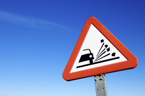
Safety signage in the workplace prevents accidents and injuries. Make sure your signs and tags do the job.
 |
You’ve seen the signs—the ones that say important things like “Bridge Out” or “Wrong Way”—but somehow the cartoon and movie characters miss them because the signs are overgrown with brush, blown over by the wind, or otherwise obscured.
On film, it’s a dramatic or comedic effect, giving the viewer information that the character does not know. In real life, though, safety signs that aren’t visible and effective can be a matter of life and death.
Requirements for Signs and Tags
It’s important to make sure that everyone in your facility is aware of all hazards. Training is one way to do the job. Appropriate signage throughout your facility is another.
This kind of signage is called “accident prevention” signage, but it could equally well be called “injury prevention” signage, since the ultimate purpose is to prevent employee injuries.
Great news! BLR’s renowned Safety.BLR.com® website now has even more time-saving features. Take our no-cost site tour! Or better yet, try it at no cost or obligation for a full 2 weeks.
OSHA requires, in 29 CFR 1910.145, that accident prevention signs and tags be used in any area where not identifying a hazard could lead to accidental injury to workers or the public or to property damage.
As with any safety device, the sign itself should not pose a hazard. It should have rounded or blunt corners and be free from sharp edges, burrs, splinters, or other sharp projections. The ends or heads of bolts or other fastening devices must be located in such a way that they do not constitute a hazard. And signs that are dirty, worn, or faded may not do the job. So be sure to clean or replace any accident prevention signs that cannot be read clearly.
Signage Basics for Employees
All employees should be familiar with the color-coding system and pictographs used in workplace signs so that they can recognize the type of danger (or safety) at a glance, even if they don’t have time (or aren’t able) to read the verbal message that gives specific information.
- Red is for danger. Red danger signs and tags with contrasting black or white lettering are used only in areas where an immediate, serious hazard—one that can cause death or serious injury—exists. Flammable liquids are typically marked in red. Red markings are also used for some safety equipment, such as emergency stop bars, buttons, and switches.
Your one-stop safety management resource, available 24/7. Go here to take a no-cost site tour or here to try it in your own office!
- Yellow is for caution. Yellow and black caution signs and tags warn about potential hazards or unsafe practices that could cause minor injuries. Wet floors, radiation, and “Do Not Enter” signs are often found in the form of yellow caution signs.
- Green is for safety. Safety instruction signs have a white background, a green panel, and black and white letters or markings. These signs provide general safety information. For example, they are used to mark the location of emergency exits, first-aid kits, and safety equipment.
The pictographs, or graphics, used on safety signs are usually self-evident. Just to make sure all workers understand their meaning, review pictographs used on safety signs in a safety meeting and give workers a matching quiz to make sure they can match the hazard to the graphic.

1 thought on “‘Sign Up’ for Workplace Safety”